Duration: Dec 2022 – Feb 2023
Client: PRAGER’S
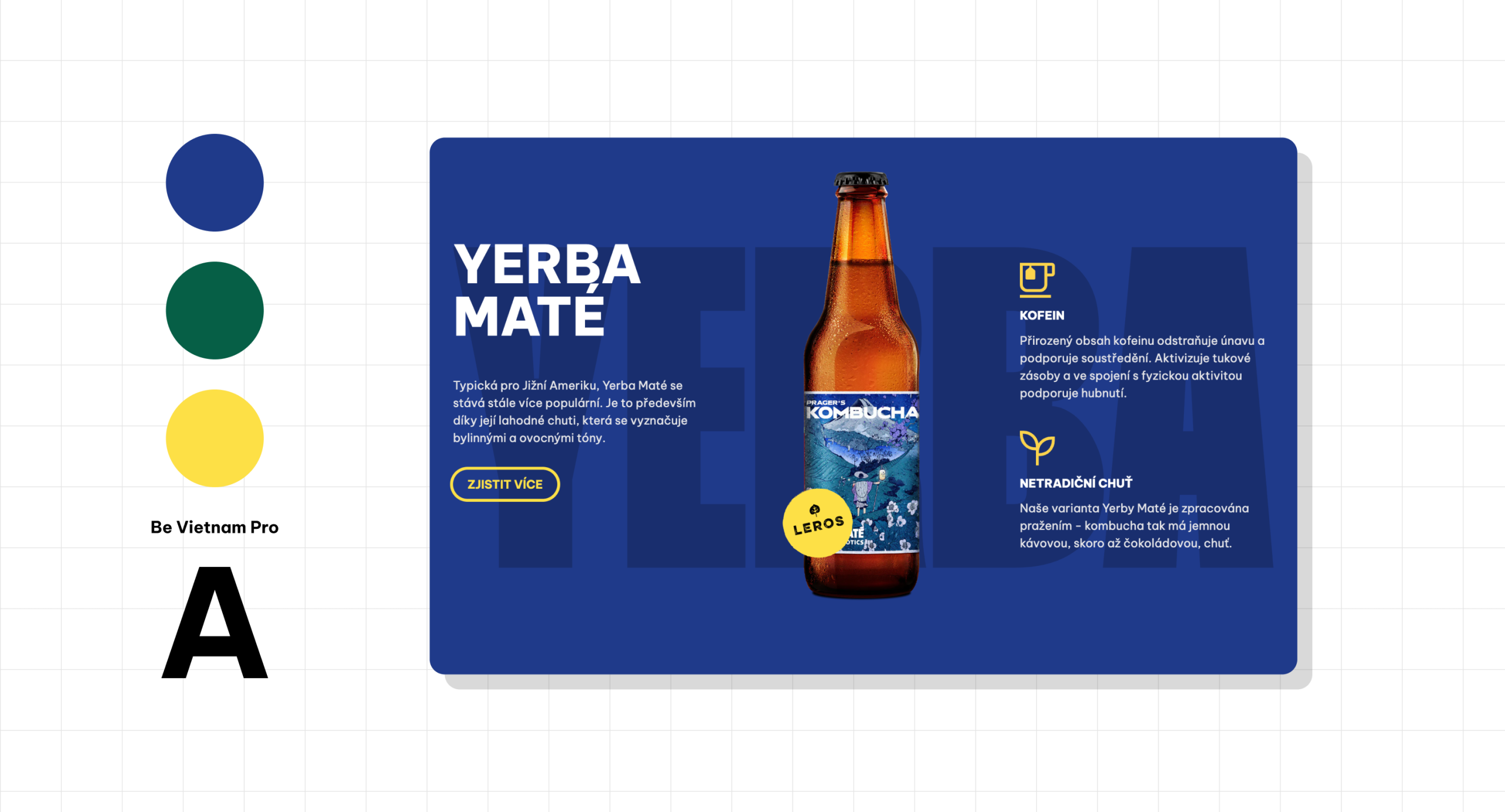
PRAGER’S Kombucha is a project under the brand of F.H. Prager dedicated to low-alcohol fermentation and tasty kombucha flavours. It aims to craft kombucha working with premium-quality tea and microbial cultures.
Role
- Wireframes
- UX & UI Design
The Problem
- PRAGER’S Kombucha is a new product on the market.
- Kombucha is not a well-known product, many people don’t know anything about its health benefits.
The Goal
- Creating a website reflecting PRAGER’S brand guidelines.
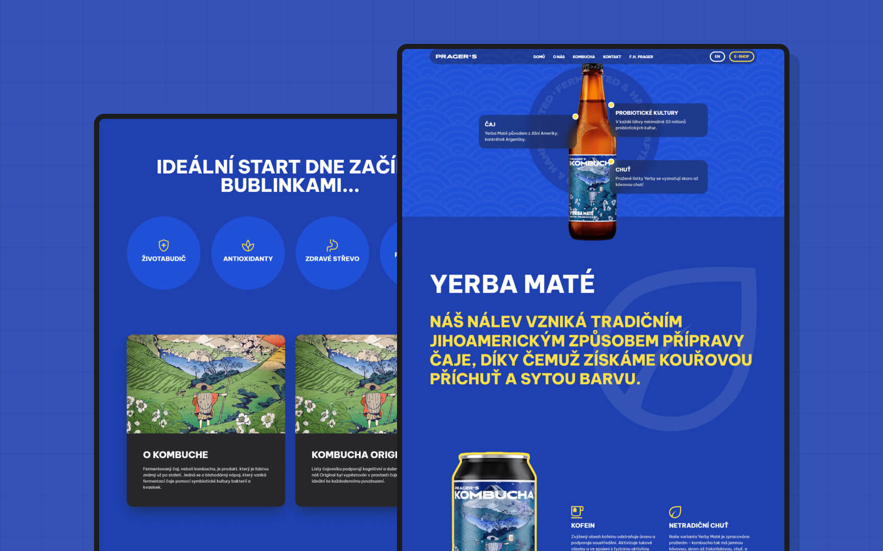
- Educating users about the health benefits of kombucha.
- Presenting PRAGER’S products and the magic behind the making.
Wireframing and Prototyping
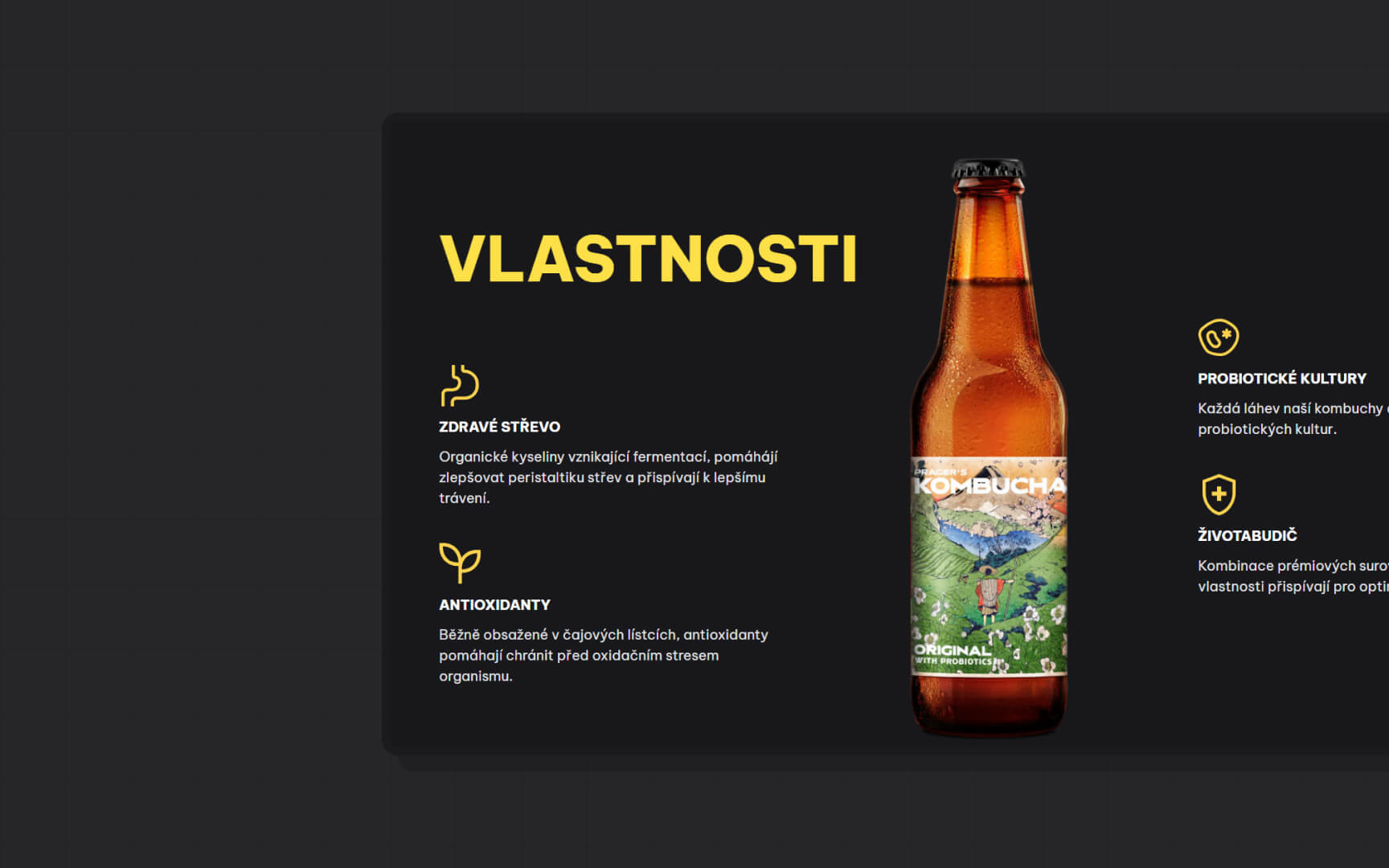
The initial stages of the design process involved creating low-fidelity wireframes to map out the basic structure and layout of the website. This step was crucial in visualizing the user flow and interactions, allowing stakeholders to see the potential look and feel of the website early in the process.
Branding
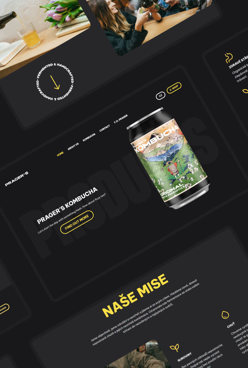
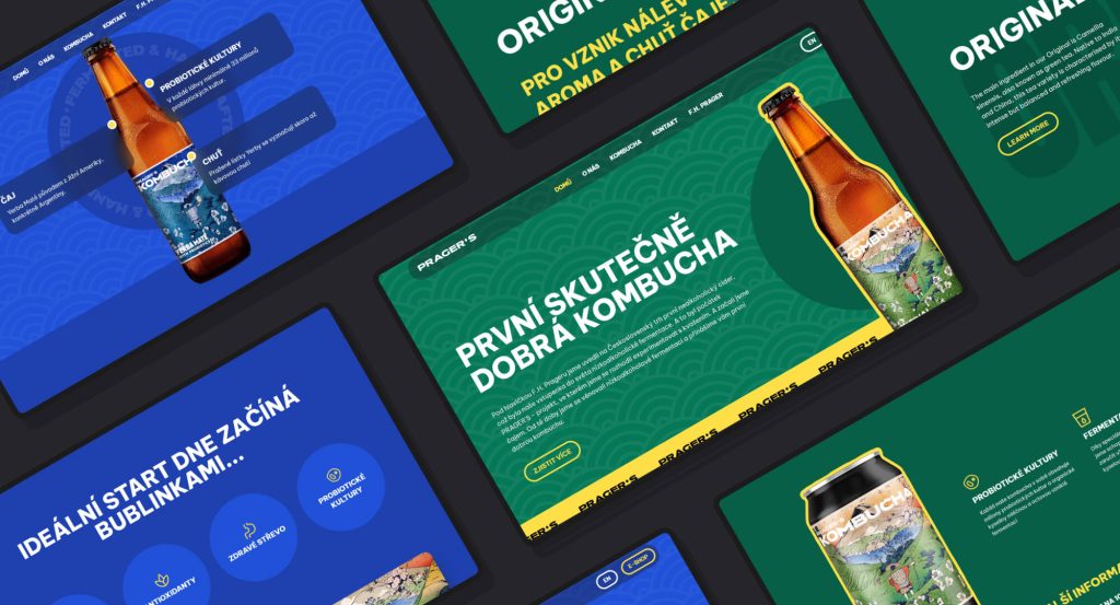
One of the key focuses of the redesign was enhancing the visuals while ensuring consistent branding. I worked with Prager’s branding guidelines to create a cohesive visual identity. This involved selecting a colour palette and graphics to highlight the unique product characteristics. The overall visual design made the website more attractive and reinforced Prager’s brand identity, creating a memorable and engaging experience.
Usability Testing
Usability testing was a core component of the design process. Conducting these tests with real users provided actionable feedback on the design’s functionality and usability. The insights gained from usability testing led to iterative improvements, ensuring that the final design was user-centered and addressed any identified pain points.
Product Pages
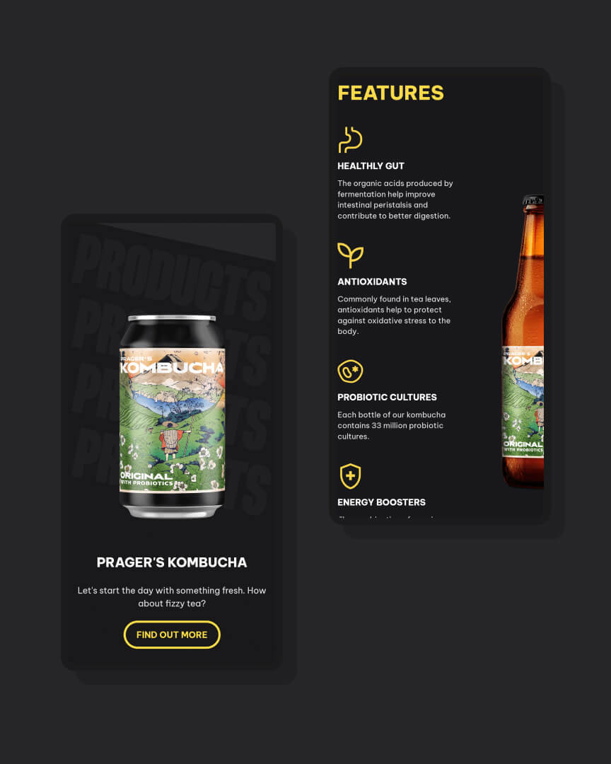
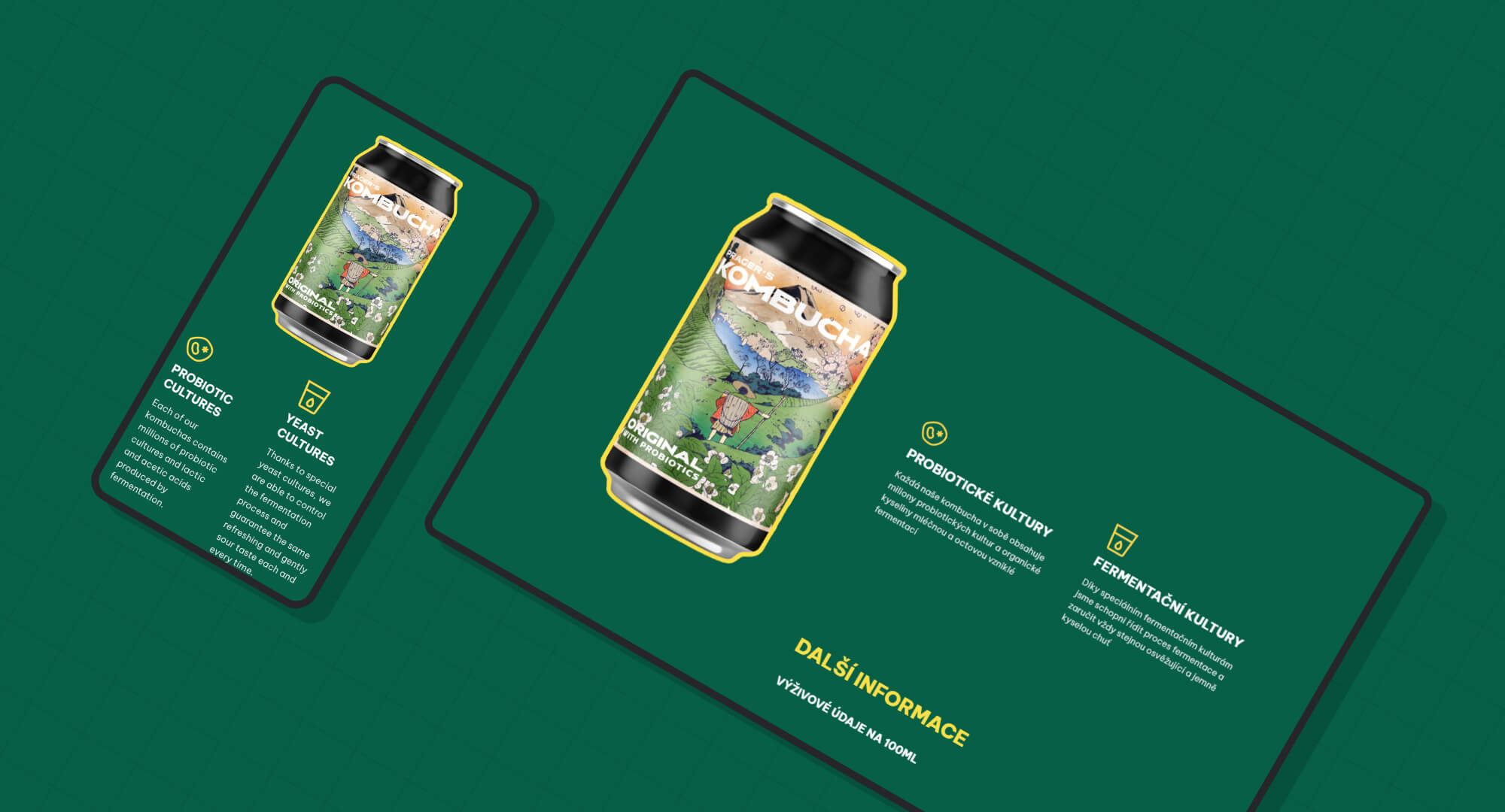
Each product page provides comprehensive information, including descriptions, graphics and images. This ensures users have all the information they need to make informed decisions about a product they need.
Responsive Design
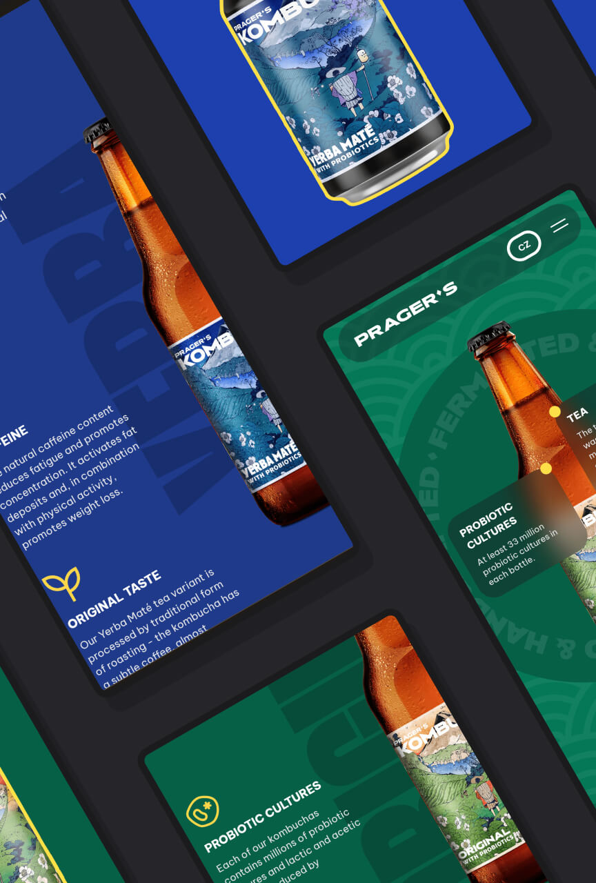
The Prager’s website was designed to be fully responsive. Users have a seamless experience regardless of the device they are using.
Credits
Web Development
Reveal
