Duration: Apr 2024 – Feb 2025
Client: Prague Pride
A year after launching, the new Prague Pride website achieved a 17.4% better usability rating compared to the old version.
Getting there required understanding not only how people used the website, but also what they thought it was for. Many visitors mistook the organisational site for a Prague Pride Festival site and didn’t learn anything about other Prague Pride projects and activities.
Role: Research, UX, UI, Development
Goal: Redesign the organisational website to improve usability, clarify its role beyond the festival, and make it easier to maintain.
Research
We began with a workshop involving the Prague Pride organisational team to gather internal goals, technical needs, and content priorities. This was followed by a user survey to collect insights about visitors’ expectations and needs.
Some of these respondents were later invited to interviews and usability testing sessions, which helped us understand their mental models in more depth.
What We Discovered
When exploring the original website, we found that:
- Many users mistook the organisational site for the Prague Pride Festival site, expecting festival schedules and event info.
- The navigation structure had duplications and unclear labels, and users were struggling to find what they were looking for.
Users were also interested in
- 🗓️ Finding community events throughout the year
- 📖 Learning about LGBTQ+ topics and education
- ❤️🩹 Joining support groups
- 💪 Opportunities to volunteer or donate
Another recurring theme from interviews was that the visual style felt too loud. Users preferred something calmer, simpler, and more mature – a tone that reflects Prague Pride’s year-round.
UX Goal
Create a website that celebrates Pride’s energy while communicating the organisation’s year-round mission clearly and intuitively.
Key UX Decisions
| Challenge | Solution |
|---|---|
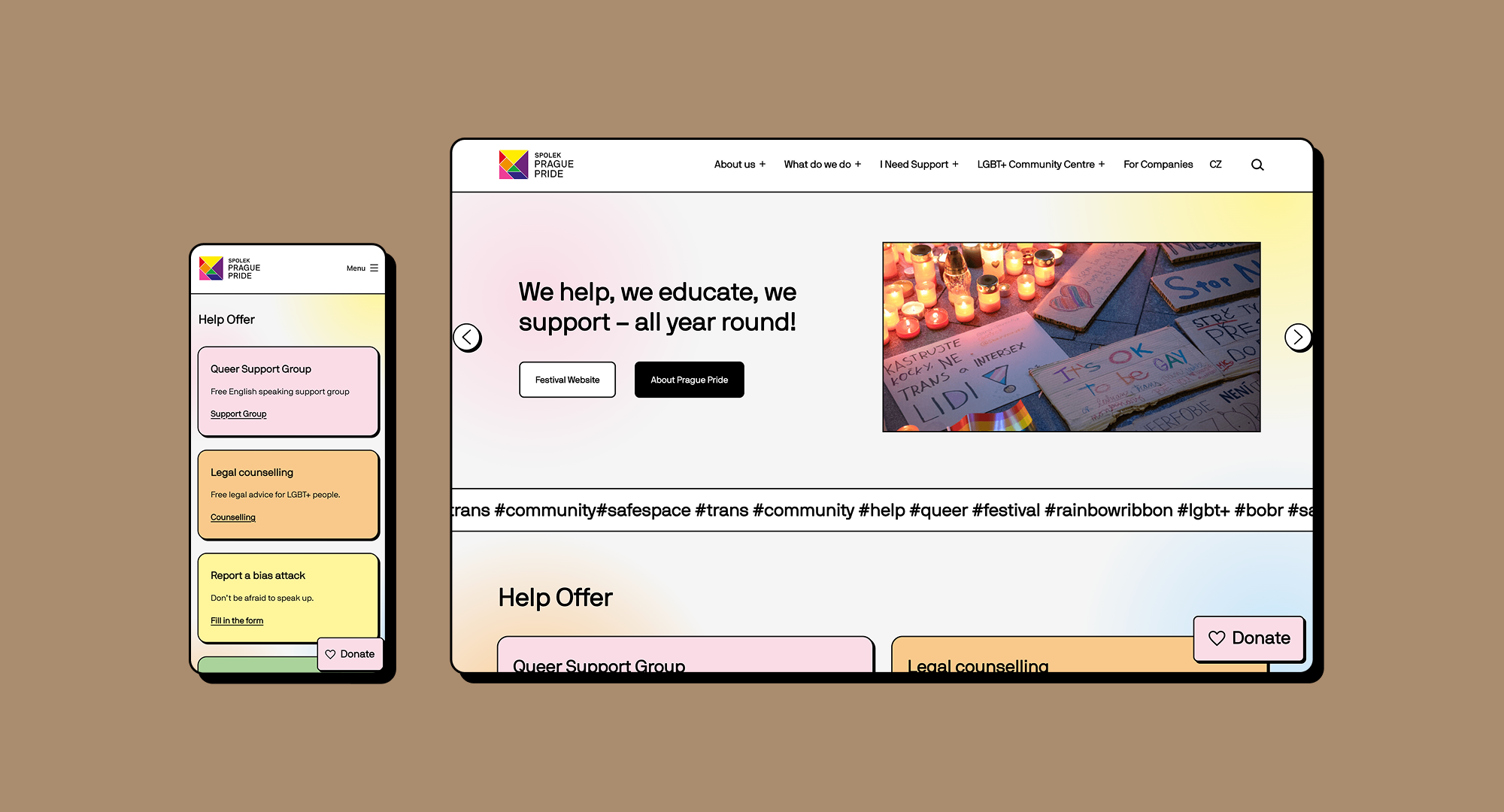
| Users mistook the site for the Festival website | Added a prominent link to the Festival site on the homepage. We also added a claim “We help, we educate, we support – all year round,” and a link leading users to learn more about the organisation. |
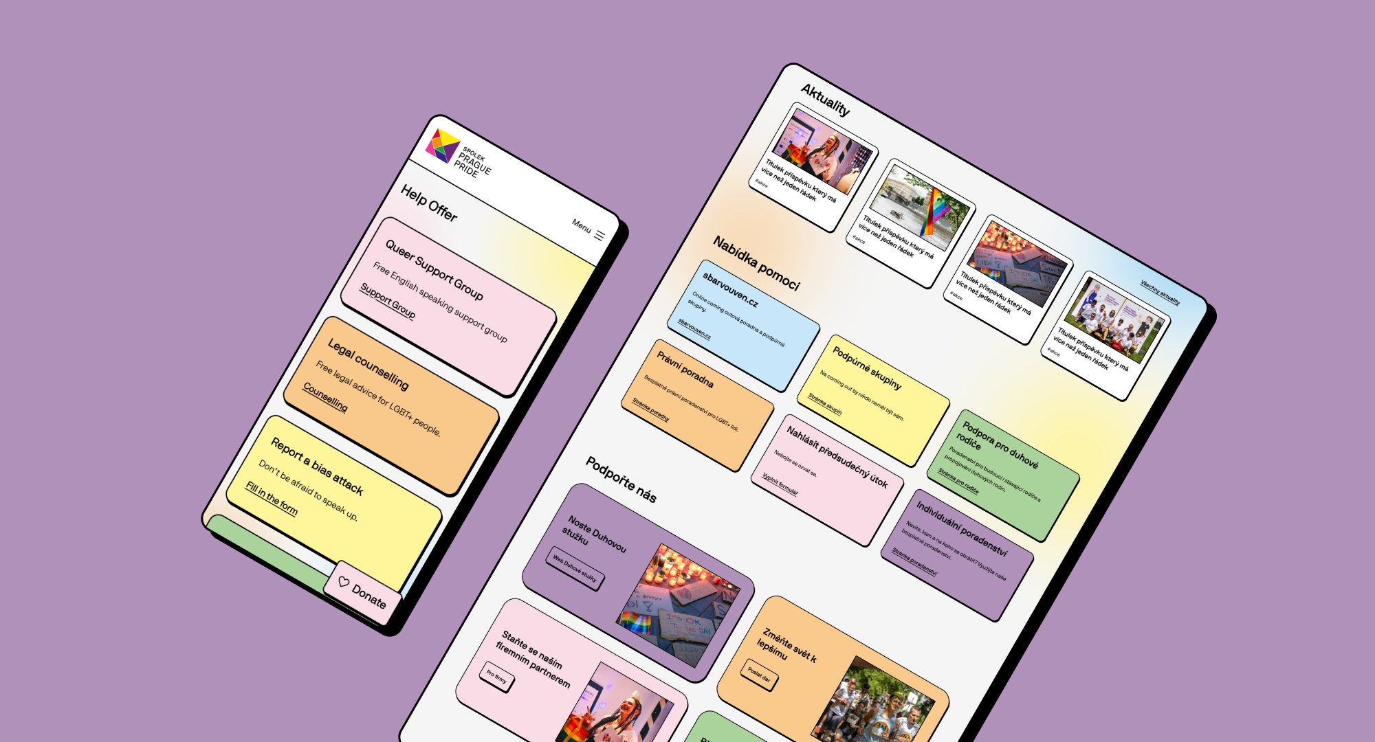
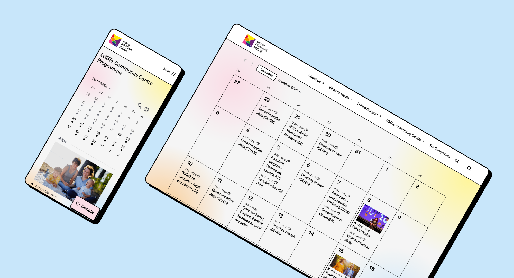
| Users couldn’t find community centre events | Introduced an event calendar showcasing all community events. |
| Content was hard to scan and updates required developers | Created reusable, CSS-styled design components in WordPress for flexible content creation. |
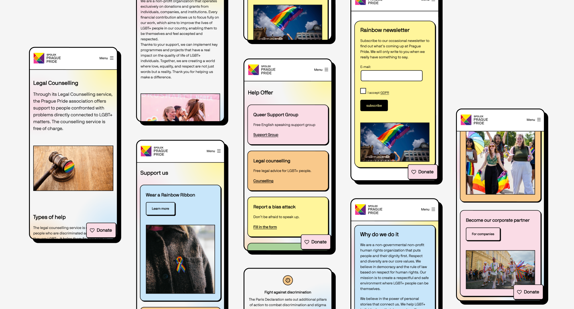
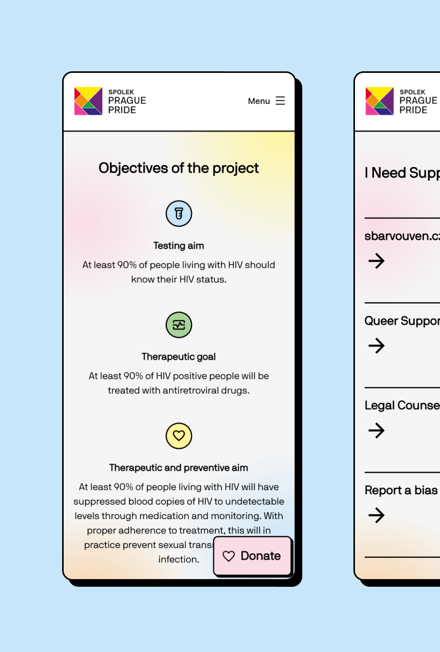
| Support services were buried deep in navigation | Brought support offerings forward, including homepage visibility and quick-access links. |
| Volunteering and donations lacked visibility | Added a dedicated section and a persistent “Donate” button anchored in the corner. |
| Navigation was confusing | Simplified and clarified menu items in collaboration with the marketing team. |
UI Design
The visual language is based on Prague Pride’s festival branding but softened for better readability and a more inclusive feel.
Interaction cues: Hard shadows under interactive elements help users distinguish CTAs and clickable areas quickly.
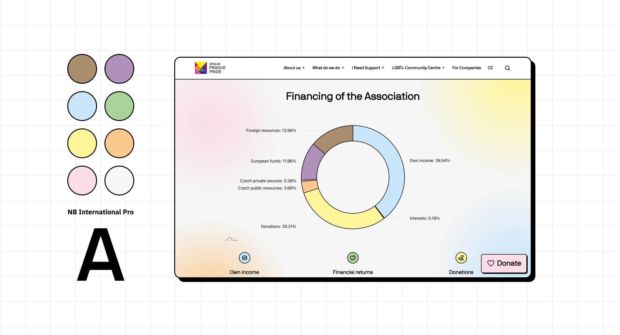
Color palette: A lighter, calmer adaptation of the rainbow spectrum to preserve Pride’s identity while improving accessibility and visual harmony.
Typography: NB International – modern, open, and friendly, aligning with the organisation’s inclusive voice.
Shapes and details: Rounded corners on cards, banners, and buttons create a sense of approachability.
Accessibility and Maintainability
Because Prague Pride’s team regularly updates the website, I focused on creating a reusable system of styled components in WordPress. This approach ensures that non-technical editors can easily add content while maintaining visual consistency and accessibility standards.
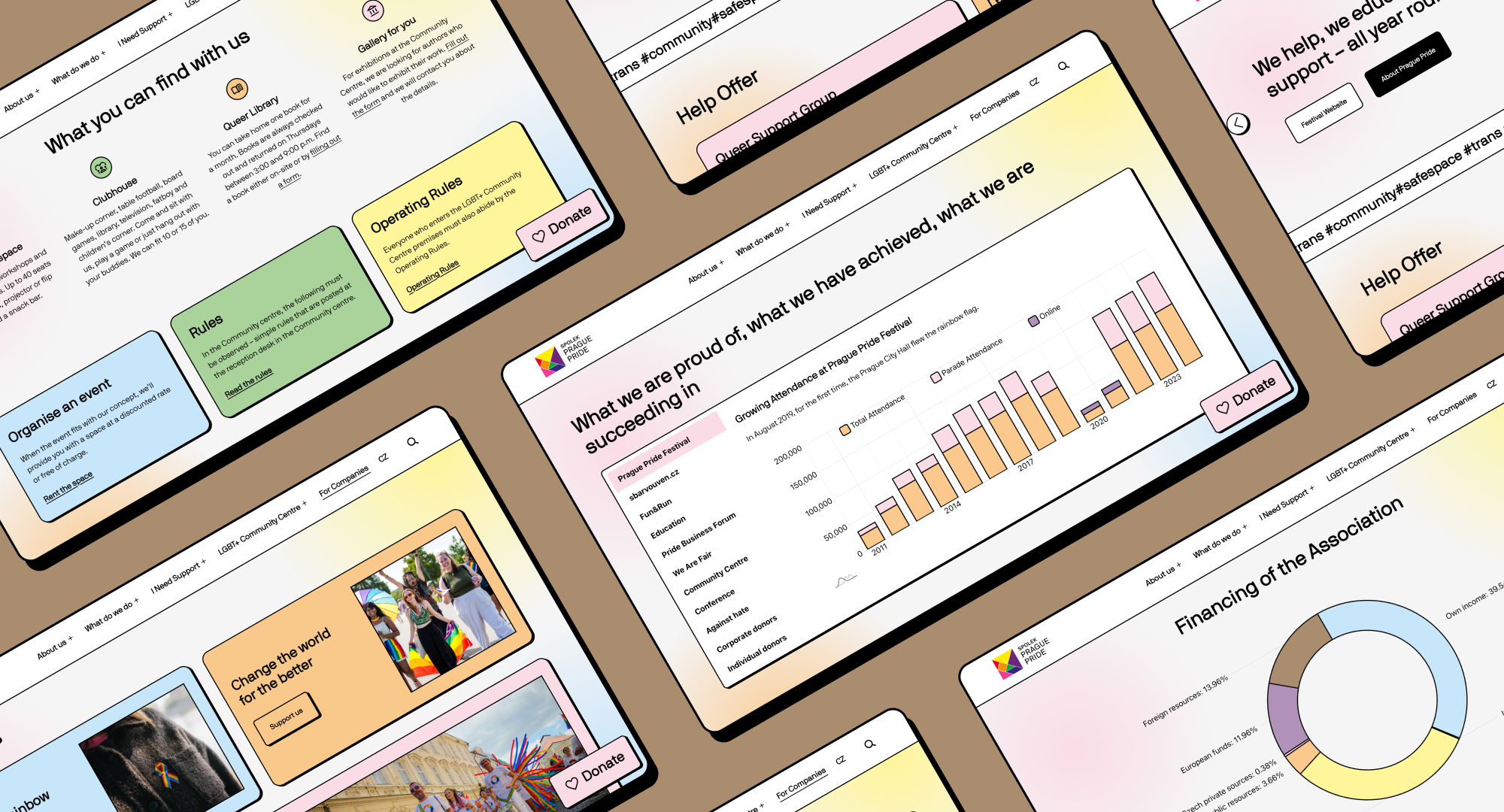
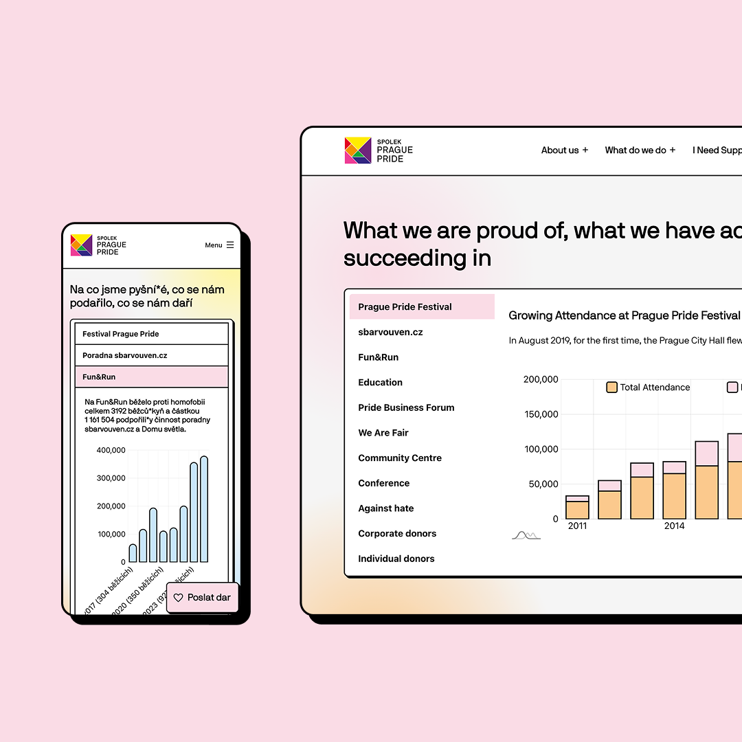
Visualising Impact
Prague Pride does impactful work year-round – from counselling to education. To help them communicate this visually, I developed interactive infographics using amCharts5. These JavaScript visualisations highlight data about their community work, helping visitors understand the scale of their impact in an engaging way.
Impact after one year
- ✅ Usability rating improved by 17.4% compared to the old website
- ✅ Visitors can distinguish between the organisational and festival sites
- ✅ The marketing team reported less dependency on developers
- ✅ Stronger alignment between brand identity and year-round mission
Reflection
This project taught me a lot about aligning user mental models with organisational identity.
The main challenge wasn’t just to make the website beautiful or usable – it was to clarify who Prague Pride is and what they stand for beyond the Festival.
Balancing vibrancy with clarity, and advocacy with usability, became the heart of this redesign.
It was deeply rewarding to create a platform that not only celebrates diversity but also supports the people behind it – all year round.